We analyse the News Inflationary Pressures Indices (NIPI) ability to forecast short-term inflation across European economies. Using a pooled estimation framework, we quantify how NIPI readings translate into expected CPI changes before benchmarking their forecast performance against an autoregressive model. We find that the NIPI carries meaningful forecasting power for near-term inflation across the region, outperforming an AR(1) benchmark by 12% on average in out-of-sample testing.
In recent notes we demonstrated that our News Based metrics such as NIPI or NBStat were leading indicators for official CPI releases, here we provide a comprehensive framework that allows for a better interpretation of those series, what their readings mean regarding upcoming CPI prints.
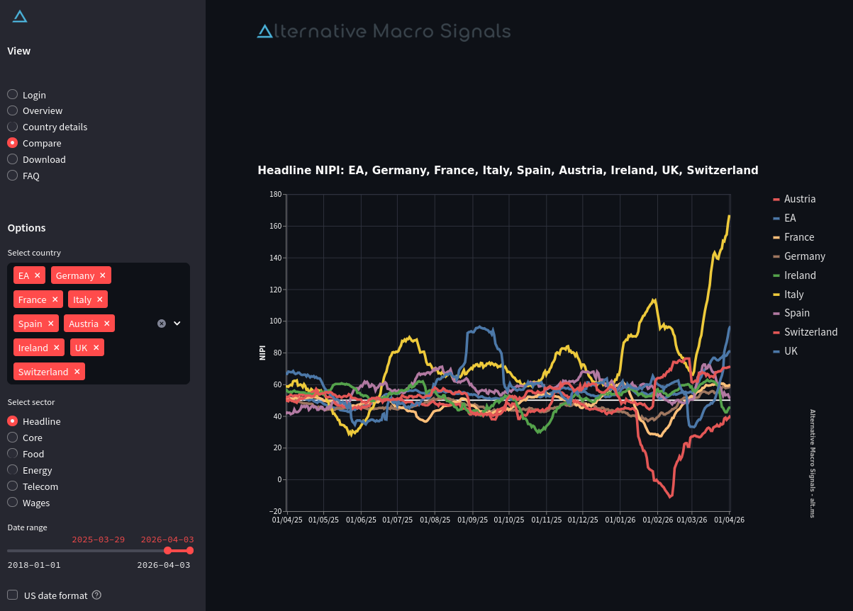
Chart 1: View from the online NIPI dashboard
With over 8 years of data now covering a full inflation cycle and an expanding set of countries, we have the statistical depth for a more formal forecast performance assessment. While the history length would still be slightly short for OLS inference in monthly frequency, the panel structure compensates by pooling observations across countries. This note applies such a framework to the European region.
Data sources and transformations
We use NIPI metrics across available countries in the Euro Area (EA), namely France, Germany, Italy, Spain, Austria & Ireland plus the EA aggregate, the UK and the Switzerland NIPIs.
The target variables are their CPI (or HICP) equivalents. In individual EA countries, the HICP measures are provided by Eurostat, while the EA aggregate is produced by the ECB. Finally, the United Kingdom and Switzerland inflation data sources is from their respective national statistics offices.
None of the NIPI series in our panel exhibit statistically significant seasonal patterns, so we use them without adjustment.
HICP or CPI time series, in contrast, display strong seasonality pattern. Using the ARIMA X-13 SEATS algorithm, we decompose each country's CPI level series into trend, seasonal and irregular components, accounting for trading day effects and country-specific public holidays. The seasonal component is then removed to obtain the adjusted series, which in turn is used to compute month-on-month growth rates. Regarding the EA aggregate, the ECB provides an already seasonally adjusted series which is used without further adjustment.
Chart 2: Seasonal factors (d10), X13 ARIMA-SEATS
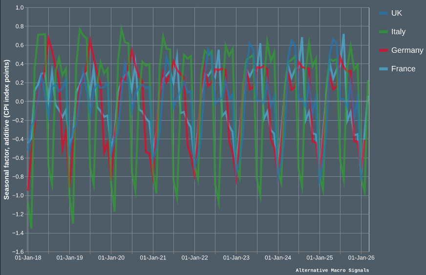
As illustrated above, seasonal patterns differ markedly across countries. Italy exhibits the largest swings, with seasonal factors ranging from -1.4 to +0.8 (percentage point), while France and the UK show more moderate amplitudes. Removing these country-specific patterns is essential to isolate the underlying price signal.
We shift the CPI index forward by one month to align it with its publication calendar: January prices, for instance, are released in early February. This ensures temporal consistency between the NIPI and CPI series.
Model specification
The first explanatory variable in our CPI model is the lagged country-specific NIPI. It is aimed at capturing idiosyncratic price developments, yielding a coefficient for each country which in turn allows for a more country-specific study and application.
We augment our specification building on Global Inflation from Ciccarelli & Mojon (2010), explaining price developments $\pi$ partly by what they call global movements. In our case this is rather a regional movement represented by the first component of a static1 Factor Model $PC1$, based on a pool of the CPI of 23 countries (all EA countries plus the UK and Switzerland, excluding the EA aggregate CPI).
The intercept $\alpha$ and the common movement loading $\gamma$ are pooled, evenly shared across countries. Both our explanatory terms are lagged, enabling further out-of-sample forecasting exercises.
$$\pi_{i,t} = \alpha + \beta_i \, NIPI_{i,t-\lambda} + \gamma \, PC1_{t-1} + \varepsilon_{i,t}$$
NIPI optimal lag
One question remains: the optimal lag $\lambda$ to apply to our NIPI term. Having daily data enables more flexible specifications. To determine it, we use grid search maximization both in terms of in-sample and out-of-sample performance.
Chart 3: NIPI lag optimization grid search
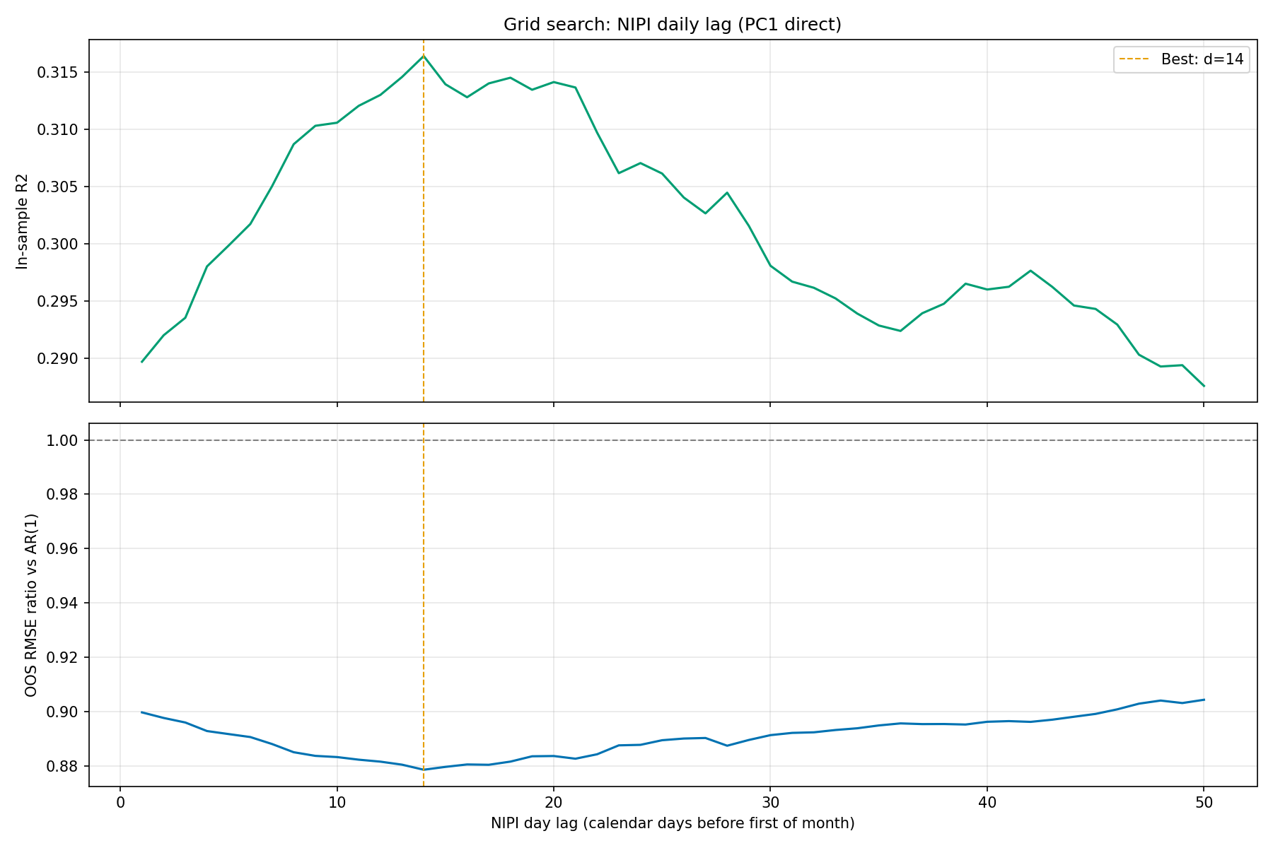
A lag of about 14 days yields the best results for the two benchmarks, maximizing the in sample explained variance and at the same time the out-of-sample forecast accuracy (in the above and below chart, the forecast accuracy is measured as a ratio between the model’s RMSE and the AR(1)).
Chart 4: NIPI lag optimization heatmap
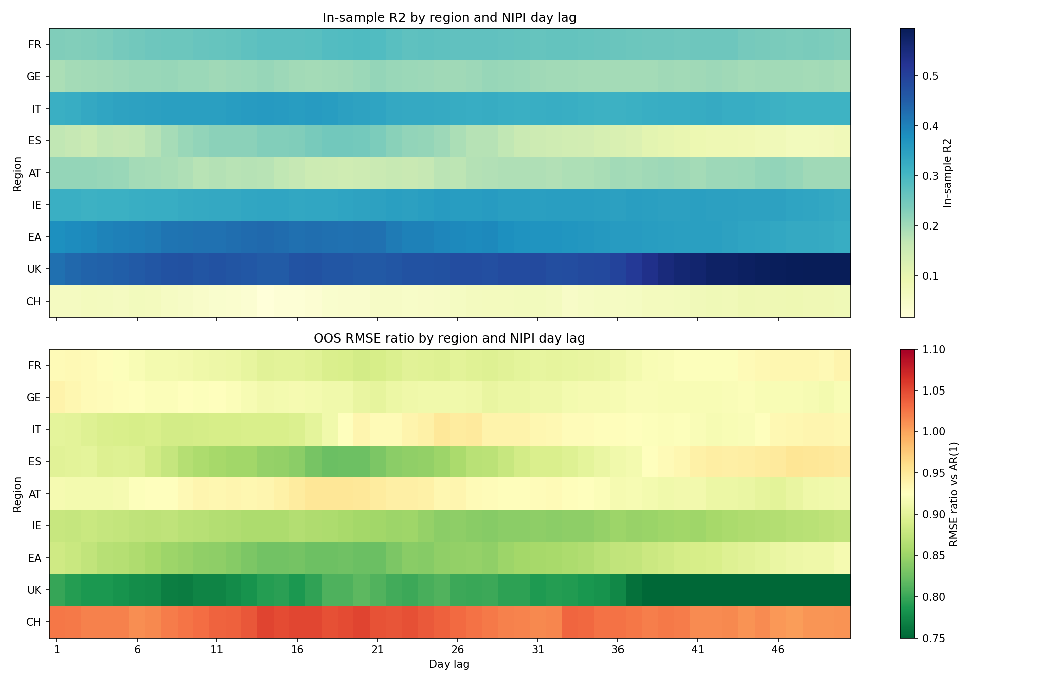
Looking at the details, the results are not homogeneous across countries. Some are stable throughout the lag structure. Others perform better on specific ranges like Spain, the Euro Area or Switzerland.
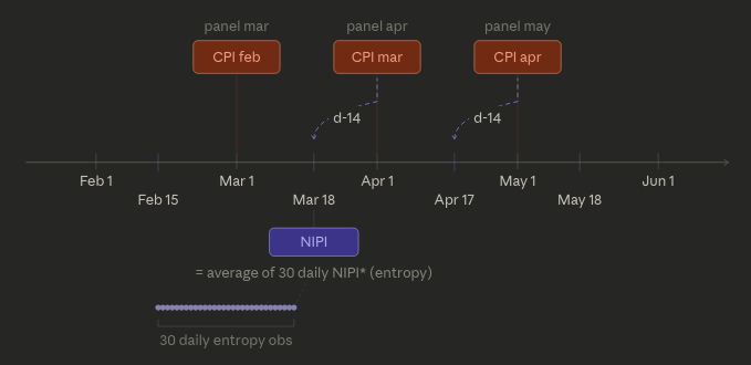
The $NIPI_{i,d-14}$ specification, in addition to being statistically sound, is economically intuitive, considering the shift applied to the CPI prints, this two-week lead time means we take the NIPI around the middle of the month we want to forecast, which is to be expected as the item price collection is rarely done on the last days of the month but, rather, compiled through the month.
Chart 5: NIPI and CPI timeline specification
Estimation results
With a sample starting in 2018 and ending in March 2026 across 9 entities, we have over 800 observations.
Table 1: In-sample estimation coefficients
| Variable | Coefficient | P-value |
|---|---|---|
| $\alpha$ | -0.2314 | <0.001 |
| ${NIPI}_{France, t-1}$ | 0.0076 | <0.001 |
| ${NIPI}_{Germany, t-1}$ | 0.0082 | <0.001 |
| ${NIPI}_{Italy, t-1}$ | 0.0055 | <0.001 |
| ${NIPI}_{Spain, t-1}$ | 0.0086 | <0.001 |
| ${NIPI}_{Austria, t-1}$ | 0.0097 | <0.001 |
| ${NIPI}_{Ireland, t-1}$ | 0.0082 | <0.001 |
| ${NIPI}_{Euro Area, t-1}$ | 0.0077 | <0.001 |
| ${NIPI}_{United Kingdom, t-1}$ | 0.0079 | <0.001 |
| ${NIPI}_{Switzerland, t-1}$ | 0.0046 | <0.001 |
| ${PC1}_{t-1}$ | 0.0304 | <0.001 |
All coefficients are strongly significant, including the intercept and the common factor. The signs are consistent with economic intuition: higher news-based inflation pressure and a stronger regional inflation factor both predict higher CPI prints.
As a consistency check, the estimated NIPI EA coefficient (0.0077) closely matches the weighted average of the four largest EA countries' individual coefficients (0.0075), confirming that the pooled estimation produces coherent results across countries.
What does a NIPI reading actually mean for inflation?
Let’s take the EA’s NIPI as an exemple. It surged during the March 2026 Middle-East crisis and reached almost 80. Multiplying this 23-point increase from its recent average by its coefficient (0.0077), the model adds roughly 0.25 percentage points to next month's expected CPI.
Chart 6: EA’s NIPI and CPI
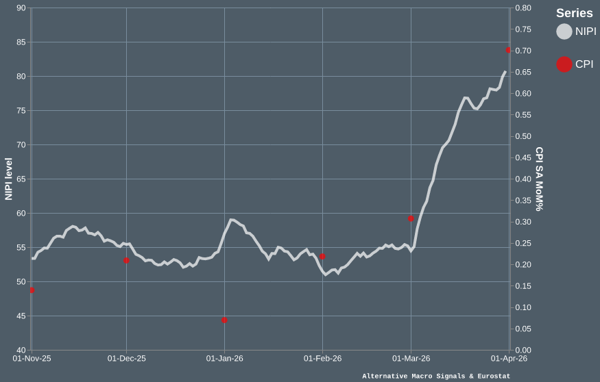
Note: CPI is shown as of initial release date, to avoid the look-ahead bias.
The prints that followed this period confirmed it, EA seasonally adjusted MoM% HICP was 0.7% percent in March, highest recorded since the COVID-19 and the Ukraine invasion energy price surge in Europe.
When inflation spiked earlier in the decade, the NIPIs across Europe doubled or tripled from their long-term levels, with Italy peaking above 190 and most countries sustaining readings above 100 for several months. In the year that followed, cumulative CPI increases across the largest euro area economies approached 10%, with Germany and Italy leading the way.
Chart 7: NIPIs’ surge during the 2021/2022 crisis
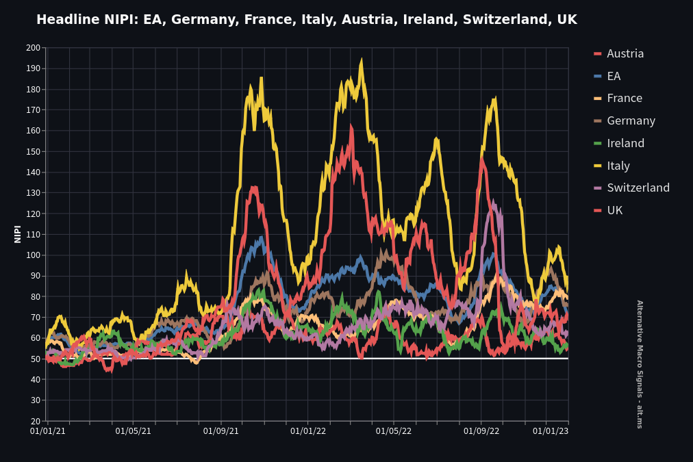
Italy sustained the highest NIPI readings during the crisis, which is precisely why its estimated coefficient (0.0055) is among the lowest. The two are mirror images of the same phenomenon: Italian news coverage of inflation is more abundant relative to actual price changes, so each NIPI point maps to a smaller CPI movement. Spain, with lower NIPI levels, shows the opposite pattern and one of the highest coefficient (0.0086).
Out-of-sample performance
Now checking the now-casting ability of this specification, we benchmark it against a simple AR(1) process. The training sample goes from March 2018 to December 2019, then an expanding out of sample comparison based on RMSE is run for each entity from January 2020 to February 2026.
Table 2: Out-of-sample RMSE performances
| Country/Region | NIPI + PC1 | AR(1) | Ratio |
|---|---|---|---|
| France | 0.2874 | 0.3197 | 0.899 |
| Germany | 0.4596 | 0.5032 | 0.913 |
| Italy | 0.4440 | 0.4989 | 0.890 |
| Spain | 0.4375 | 0.5168 | 0.846 |
| Austria | 0.4157 | 0.4445 | 0.935 |
| Ireland | 0.3551 | 0.4132 | 0.859 |
| Euro Area | 0.2983 | 0.3608 | 0.827 |
| United Kingdom | 0.3034 | 0.3839 | 0.790 |
| Switzerland | 0.1736 | 0.1648 | 1.053 |
| Average | 0.3641 | 0.4143 | 0.879 |
The model improves on the AR(1) for every region except Switzerland, with an average RMSE reduction of 12% across the board. The specification proves particularly effective for the Euro Area Aggregate and for the United Kingdom with RMSE reductions around 20%.
Chart 8: Cumulative out-of-sample RMSE over time
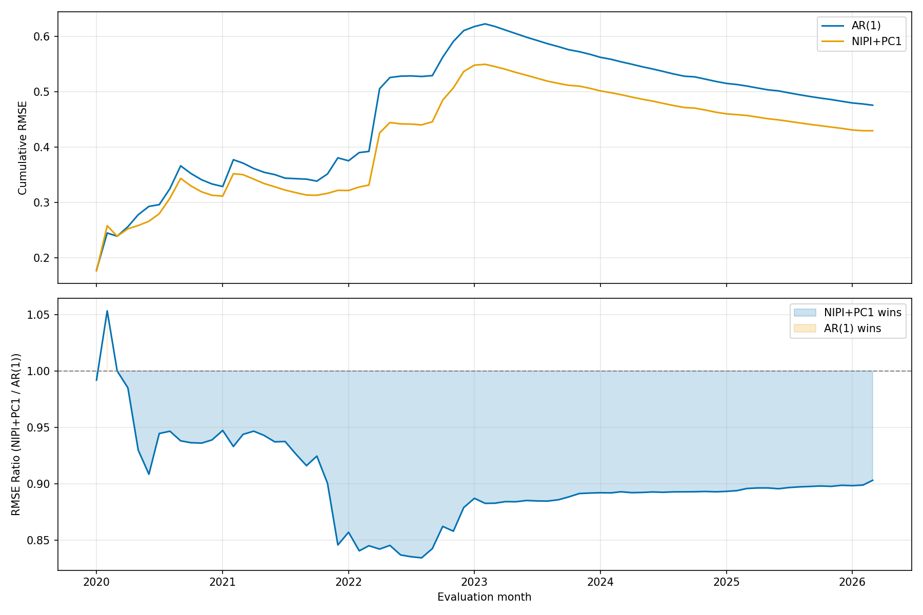
The largest gains over the AR(1) benchmark appear during the 2022 energy crisis. This is consistent with how we should approach news coverage : attention to price changes is not proportional, it shifts regime above a certain threshold, generating a non-linear signal that autoregressive models cannot replicate.
The NIPI inherits this property2, which explains why the specification's edge is largest precisely during episodes of intense price pressure.
Moreover, the model consistently outperforms the autoregressive benchmark across almost all regions, including during the more subdued inflationary environment of 2024-2025. This suggests that the NIPI carries genuine informational content about upcoming CPI prints, not just in crisis periods but as a persistent nowcasting signal.
Summing up our main findings
- The NIPI can help forecast short-term inflation across European economies.
- The model consistently outperforms an AR(1) benchmark out-of-sample, with an average RMSE reduction of 12%.
- The largest gains appear during periods of regime changes (rapid upsurge or drop), consistent with the non-linear nature of news coverage.
These results could be further developed in a number of ways: by fully leveraging on the NIPI's daily frequency through mixed-frequency specifications, investigating the non-linear regime structure in news coverage using our own data, or extending the panel as new country NIPIs become available.
The framework presented here confirms that the NIPI carries meaningful nowcasting power across a diverse set of European economies. As the dataset deepens, we expect this mapping to become increasingly precise, offering a practical tool for interpreting our news-based inflation signals in real time.
↩ 1 We also tested a dynamic factor specification (Kalman-filtered). Results are almost identical to the static specification, consistent with the findings of Ciccarelli & Mojon (2010).
↩ 2 The NIPI is a daily diffusion index measuring the balance of positive and negative near-term inflation news over a 30-day rolling window, centered around 50. By construction, it reflects media attention intensity: when price pressures cross salience thresholds, the volume of inflation-related news increases disproportionately, pulling the index further from its neutral level.
To know more about our data,reach out.
