US electricity prices have faced growing inflationary pressures since early 2025, driven by AI data center demand and an aging grid. Alternative Macro Signals tracks the shock in real time using NLP-based news metrics, providing an early-warning edge.

It is easy to get caught off guard by the next critical inflation item. Egg prices, rice in Japan, or car insurance price drops: the list could drag endlessly. Those shocks are often unique and there is not always an historical template we can rely on.
How can we make sure we track the right input data when they occur?
The answer we suggest would be: by collecting text data and processing it systematically.
Alternative Macro Signals collects inflation news. Any kind of consumer-related inflation news. And from those, we can compute historical inflation signals for virtually any item. We have done so consistently (with unrevised models and data collection process) since 2020.
Here is an application to the ongoing US electricity price shock, going from the quantitative signals to the actual news behind:
Quantitative Signals to Track the Electricity Price Shock in the US
The COVID-19 period has shown that there is so much more to energy prices than oil.
Electricity prices have had a growing importance in the basket. Unlike oil, they are largely driven by local factors.
Within our data tracking consumer inflation news, we can identify the news related to electricity prices and compute three metrics to characterize their evolution over time1.
The first metric is the volume of electricity related inflation news. It takes into account every inflation news published on day t linked to a specific subject or sector in a given region. The following chart reports the rolling 30-day average number of electricity price news in the United States in the last couple of years or so:

A continuous rise in the news volume has been underway since January 2025, notably peaking firstly in January 2025, then again during the trade war period, and finally in early 2026 again.
Second, we can also look at the “sign” of those news, i.e. whether our trained language models recognize them as positive or negative for the inflation outlook.
The average daily sign is computed as a ratio, where the numerator is the difference between the sum of positive news probabilities and the sum of negative news probabilities and the denominator is the total volume of news (+1 meaning all news have a probability of being positive of 1 and -1 a probability of being negative of 1).
Without surprise, the electricity price related news flow has been clearly in inflation-positive territory:

Not only are electricity prices showing up more often in the news, but they are increasingly mentioned in an inflationary context.
The third metric combines the previous “Volume” and “Sign” information: the News Balance is the Volume of News multiplied by their Sign, which represents a Diffusion index for inflationary pressures.
It can be compared with official inflation measures. We have found strong statistical evidence that our NIPI data – aggregate, not item levels, quantitative signals derived from inflation news - leads CPI inflation by several months, while the News Balance is fundamentally derived from the same data and models.
The News Balance and CPI electricity have moved in sync for most of 2024 and at the start of 2025. However, since around mid-2025, the two have diverged: the Balance Index surged while the CPI prints remained relatively flat2.

Note: in our data and publications, we infer the missing US CPI points as the average between the previous and the following months levels, in SA terms.
Finally, the news balance can be used to place the US electricity price surge in an international in context:

While the electricity news flow has normalized after the 2022–2023 crisis in most countries, the US has followed another path starting in 2025.
There are times when aggregated metrics are not enough and we need to dig into the details to uncover the underlying factors. With our database and tools, we can investigate those factors in detail.
Underlying News: Multiple Factors Behind The US Electricity Price Surge
Multiple demand and supply factors combine to explain the ongoing surge in electricity price news since mid-2025.
A now well-advertised demand surge driver emanates from AI and data centers investment. As shown on the graph below, since early July 2025, US energy news mentioning those items shifted from background noise to a steady positive balance, reflecting a surge in articles predominantly inflationary in tone. This illustrates a core feature of our News Balance metrics: we can isolate and track price pressures associated with specific keywords or topics within a given sector and region. The data is accessible via an API endpoint (see documentation) and a dedicated App.

US data center power demand is now expected to reach between 106 GW and 123 GW by 2035, roughly triple today’s estimated 35–40 GW and almost 40% higher than projections made only a few months ago. For comparison, total US electricity production capacity demand is around 1300 GW today. Therefore, data centers could account for close to 9% of nationwide electricity use by 2035, up from roughly 3% today.
The general electrification process contributes to the demand surge. More and more of what used to run on fossil fuels is being shifted onto the grid: cars, heating systems, etc.
Finally, winter storms have recently illustrated how any demand surge can test the systems limit: for a few days, the largest grid operator, PJM, from the mid-Atlantic region, alerted that demand would approach critical safety thresholds. As a result, wholesale prices rose briefly above $1,800 per megawatt-hour.
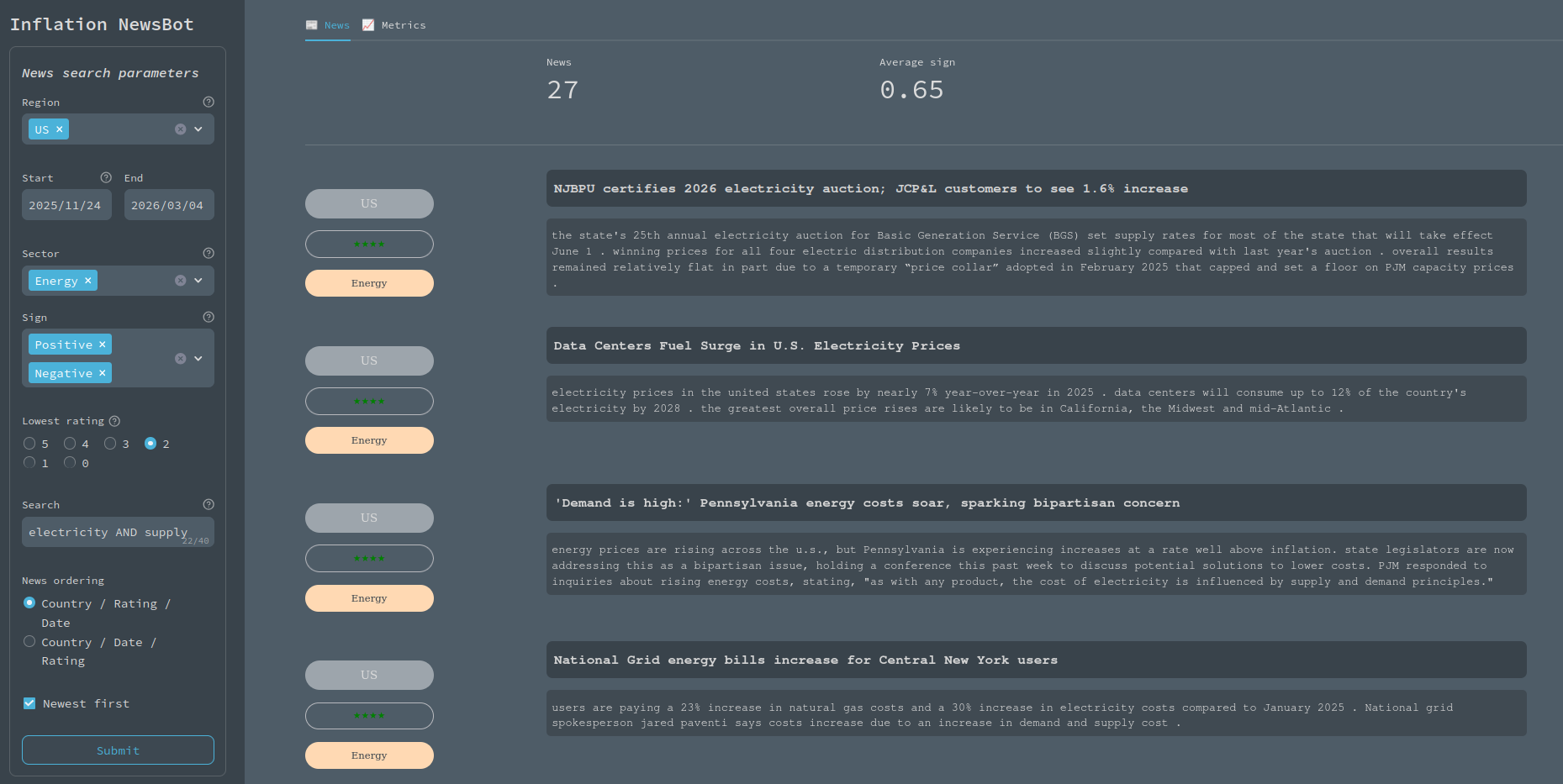
So far, most of the media coverage has focused on the demand side. But our Inflation NewsBot App shows that supply factors are important, too. When we filter US energy stories that are simultaneously about “electricity” and “supply”, a steady stream of headlines emerges about an aging grid, constrained capacity, and prices drifting higher whenever supply struggles to keep up, as shown by this (small) news extract from the NewsBot App:
Aging infrastructures are to be blamed: during decades, moderate demand growth and legacy capacity made it possible for utilities to postpone major upgrades and modernisation efforts. Such structural underinvestment has now run its course, just as the system needs more capacity to handle a more volatile and complex load. Meanwhile, most of the required inputs (from copper and aluminium to transformers and gridscale batteries) have become significantly more expensive. This trend is also currently exacerbated by import duties.
Admin hurdles and limitations to interconnection infrastructures have been preventing potential new electricity supply to reach consumers, with PJM, once again, the textbook case. Projects that could have eased today’s tight markets often spent years stuck in studies and approvals.
The result is a long list of projects that will never be built. More recently, some projects were outright canceled, on the back of political opposition to renewable energy at both federal and state levels. Either way, the shortfall between what the grid needs and what is actually being built continues to widen.
PJM's December 2025 capacity auction exposed the gap between regulated pricing and actual grid needs. For the third consecutive year, the auction hit the price cap at $333.44 per MW-day, yet still cleared only a 14.8% reserve margin, well below the 20% regulatory requirement and the lowest since 2007.
The political response tends to lock in the distortion. For instance, Pennsylvania's governor moved to extend the cap through 2030, shielding households from near-term rate shock but removing the price signal that would normally attract new capacity. Keeping capacity prices artificially low makes it harder to close the very gap the auction just revealed.
Those supply and demand factors have compounding effects. Taken in isolation, they probably would be manageable. But, together, they risk durably pressuring consumer and industry electricity prices.
Through daily inflation news metrics on virtually any topic and the ability to dig into the underlying driving forces, the News Balance and NewsBot data can help prepare for the next unpredictable inflation (or disinflation) shock.
↩ 1 News Balance class series allow for custom indexes, on a chosen topic, in a given region and across its three metrics: volume, sign and the balance. A brief explanation can be found in the initial blog post.
↩ 2 One has to take into account that not only CPI prints (when available) yield information solely once a month, but its publication is delayed, information about prices on a certain category at month t is typically available mid-month t+1. Our charts reflects this by plotting each CPI data point at its effective release date rather than the reference month.
To know more about our data,reach out.
